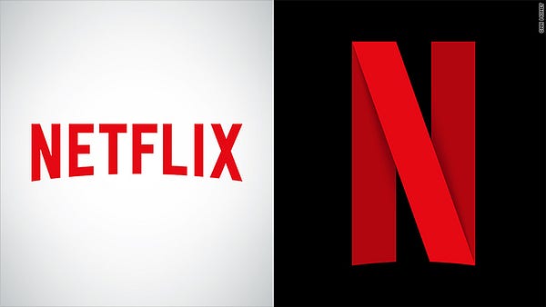
The new icon drops the ‘etflix’ with just the ’N’ remaining. The flat letterform has been redesigned as an angular ribbon with subtle drop shadows, giving the illusion of depth.
Netflix has described the icon as a “new piece of statement jewelry” on Twitter when some people questioned if the icon would indicate a full brand redesign. But the new icon — as of now — will only be used for the company’s social media profiles and mobile app.
For Netflix and for the user experience with their brand, the logo decision makes complete sense. Using only the ’N’ will be more recognizable and readable on small screens. And when you’re working with images that have display sizes equivalent to that of an eraser on a #2 pencil, maximizing screen space is the top priority.
This departure from the rest of the brand has some purists up in arms, asking why Netflix didn’t just use the ’N’ straight from their sans serif logo, forgoing the addition of a ribbon altogether. The result would have been just as effective.

However, using a unique icon that differs from the main logo is nothing new. In February, Uber electrified its users with a whole new brand design, including apps that departed drastically from the company’s logo. The white geometric — almost hieroglyphic icons are paired with crossing linear patterns unique to regions. Elegant, but almost too sophisticated. Like a Rothko painting, to truly understand Uber’s app icons, you need to read the rationale that lead to the aesthetic decisions. Which you can find on Uber’s brand standards.
If Uber’s new icons were like a shock wave, Netflix’s are barely a ripple. The new ’N’ is hardly revolutionary. Ribbon motifs are a pretty tired design trend, think 2011 Microsoft Suite. Although the Netflix icon is flatter and sharper, it seems a bit conventional. Perhaps the ribbon is meant to harken thoughts of the Hollywood red carpet or the red curtains in a film theater? Either way, it would be interesting to see what some of the runners up were.
Regardless, it makes me wonder, what other old design trends will resurface with the continued need to optimize for smaller screens and the strive to stand out from the crowd? Maybe, companies will return to the high-gloss, extruded plastic icons of web 2.0 next?