At Bigwidesky, we often get asked, “So, what is it you guys actually do?” Many times, the answer to this question lies in a fifteen-minute in-person conversation.
There are infinite ways to approach a problem and solve it. Bigwidesky helps companies facing transformational crises. We do this by guiding them into the unknown, identifying challenges, and giving them tools and strategies to deal with both obvious and hidden problems.
In other words, it’s complicated.
When we redesigned our website, we knew we didn’t have the benefit of a 15-minute in-person conversation. More likely, we had 2.5 seconds to make a visceral impact and hopefully be memorable enough that they might recall our name.
Adding another layer of complexity, we wanted a metaphor to describe the big, abstract crises that leaders are facing – something that would be compelling, relatable and would resonate with people across different backgrounds, industries and experiences.
Creating a Brand Narrative
So, how would we visualize this unknown? How would we depict these massive, overbearing crises that impact a company’s existence in an uncertain future? For thousands of years, humans have relied on archetypal narratives to help describe abstract ideas. The hero’s journey shows up across cultures and throughout time. It’s a relatable narrative that doubles as a roadmap for facing change. We know that narratives serve a dual-purpose of conveying information. The stories of ancient cultures often functioned as navigational instructions that could be passed down through generations.

We developed a series, called Crushed By the Machine, with a hero, Alex, who represents a business leader navigating a changing landscape. Alex must lead the team through organizational crises and make the business more human.
Navigating Crisis


The crises that businesses face can truly feel crushing, or at least daunting, mentally consuming and oppressive. They’re problems that keep leaders up at night and threaten their company’s existence. It could be that the company isn’t growing. Or the employees aren’t aligned and happy. Or the expensive systems that have been implemented aren’t being used effectively.
In the three crisis scenes we depicted, the figures are the size of ants, while the objects that represent crisis are massive. At the same time, we wanted to show that the solution to overcoming these situations requires vision, collaboration and a human-centered approach.

We drew our creative inspiration from stories that captivated us as children. The whimsical and minimalistic black and white illustrations of Shel Silverstien and Saul Steinberg inspired us to stretch our imagination in how abstractly we could depict crises. The monsters of Maurice Sendak influenced our characters.

The imagination and wide-open possibilities of these childhood story books connected with how we orient our approach to facing business challenges. Yes, the crises faced by leaders today can be overwhelming and the stakes are high — but often fear limits the presented choices. When facing these challenges, instead of backing into fear and limiting possibility, we can choose to face the unknown with an openness that allows us to widen our available options.
Through the visualization of these crises and the hero’s journey, we hope to offer another way at viewing the problem and widen leaders’ perspectives.
As a designer, I like order. When I design for print or web, I create a typographical system that establishes hierarchy and consistency. Most typography sources recommend something similar and would caution using multiple display fonts to set body paragraphs unless you want your project to look like a ransom note.
For the most part, I agree. It makes sense that higher retention could be achieved with increased legibility and consistent structure — but I have also learned there is another side to this argument, and it has to do with something called disfluent fonts.
Disfluent fonts have improved reader retention. Disfluency increases cognitive load on a reader, slowing down their reading speed. The jarring disruption prohibits the reader from getting comfortable with the conventions of a typeface. There are several ways this can be achieved; setting paragraphs in alternating typefaces or using an uncommon font with irregularities or flourishes can act as a legibility speed bump.
In other words, a designer’s worst nightmare. Using ugly fonts, breaking typographical rules and using typefaces outside of their designed use. I didn’t know if I was comfortable with this new finding or if I would actually find it useful. But as I researched further, I found that it isn’t necessarily about the ugliness of a typeface, but rather its unexpected form that increases the recall.
The Legibility Wars
Legibility is the most important factor considered when designing a new typeface. Whether you deal intimately with typography or not, we have visceral reaction to fonts that are difficult to read. Emigre was one of the first type foundries pioneering divergent type design. Many critics were so opposed to their experimental fonts that the debate was nicknamed “The Legibility Wars”.
With an instinctive reaction against disfluency, it seemed backwards to think that an illegible font can be more effective at conveying important information.
However, an article published in Cognition by Princeton psychologist, Daniel Oppenheimer that contradicts this thinking.
“Oppenheimer conducted a study on 28 college students where they were asked to read two fictitious biological profiles on the pangerish and the norgletti species. One profile was set in gray 12-point Comic Sans or Bodoni font and the other was set in black 16-point Arial font. After reading these profiles, they were asked to recall facts from both. The rate of retention for the profile set in the hard-to-read Comic Sans/Bodoni was 87% compared to 73% for 16-point Arial.”
Oppenheimer continued his study at an Ohio high school for a semester where he found that students performed better on tests when the material was presented in less legible typefaces.

The findings of the experiment support the disfluency theory; when information is set in a disfluent font, recall is improved when the reader is forced to slow down to decipher the words. Harder to read text is also harder to skim over.
User Experience and the Web
Now hold on a second — before we all start setting every other paragraph in a different typeface, take into account the context of the study. These students were required to read the passages and extrinsically motivated to pass a test. They were more determined to read the article to the end because they knew they would be quizzed on it later. Disfluent fonts work well in educational settings, but will they work well in other uses?
In UX design, removing unnecessary strain on users is paramount. Would you like to see a website navigation in Bleeding Cowboys?
Also take into account that we are in scan mode online. Most users read about 20% of the words on the average webpage according to Jacob Neilson’s eyetracking studies. Unlike in the Oppenheimer study, the only thing compelling us to read to the end of a webpage is our interest in the content.
If this post were more strenuous to read many people wouldn’t make it past the first sentence. Disfluent fonts can act as an inhibitor when the reader’s attention or motivation is weak to begin with.
In instances such as these there are small things we can do to emphasize important concepts and key takeaways when writing. Even the switch from regular to italic is a slight enough interruption that signals to the reader a heightened importance on a word or phrase.
In other cases, disfluency is a powerful tool for designers to create greater impact with their audience. David Carson used this technique successfully to create images that were difficult to decipher, but were extremely memorable. The disruption of the expected is what is truly effective in marketing.

Beauty and the Beast
In the definition of disfluency, I gave earlier, I described a disfluent typeface as ugly and displeasing to read. This is a bit misleading because it’s not a requirement that all disfluent type be ugly to function well.
A disfluent typeface could be beautiful while serving its purpose. In the same way that fonts like Dyslexie are designed to help people with dyslexia read with more ease, a font specifically created to slow readers down and increase retention could be produced.

Disfluency in Marketing
Like most things, there is a time and place to use disfluent fonts. Successfully reaching our audience with type is dependent on the methods used to modify it. Understanding the audience’s mindset is key in any form of communication, which will lead to a more thoughtful end result. When appropriately used, disfluency can be incredibly effective, but careful consideration must be taken to balance the strain on the reader.
As we continue searching for new ways to engage and interact with our audience, disfluency could prove to be a valuable tool. Disfluent practices could be used as a measure for viewer engagement. If 5% of your audience is determined enough to read through to the end, maybe you should be tailoring your marketing strategy to target this group more effectively. Who knows? The possibilities of disfluency are just beginning to be explored!
Sources and Links
- Oppenheimer study
https://web.princeton.edu/sites/opplab/papers/Diemand-Yauman_Oppenheimer_2010.pdf - Study that builds off of Oppenheimer study and effect of disfluency on self-disclosure
https://www.usenix.org/system/files/2013-laser-balebako.pdf - Another article recapping study
https://www.wired.com/2011/01/the-benefit-of-ugly-fonts/ - A good resource for typography in use
https://fontsinuse.com - Jacob Neilson Studies
https://dl.acm.org/citation.cfm?doid=1326561.1326566 - Dislexia Font
https://www.dyslexiefont.com/en/dyslexia-font/ - End of article, there is a negative view on the Oppenheimer study
https://typedia.com/blog/post/type-news-with-or-without/ - Study on the limits of disfluency
https://bjorklab.psych.ucla.edu/pubs/Yue_Castel_RBjork_inpress.pdf
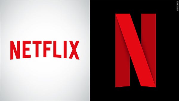
The new icon drops the ‘etflix’ with just the ’N’ remaining. The flat letterform has been redesigned as an angular ribbon with subtle drop shadows, giving the illusion of depth.
Netflix has described the icon as a “new piece of statement jewelry” on Twitter when some people questioned if the icon would indicate a full brand redesign. But the new icon — as of now — will only be used for the company’s social media profiles and mobile app.
For Netflix and for the user experience with their brand, the logo decision makes complete sense. Using only the ’N’ will be more recognizable and readable on small screens. And when you’re working with images that have display sizes equivalent to that of an eraser on a #2 pencil, maximizing screen space is the top priority.
This departure from the rest of the brand has some purists up in arms, asking why Netflix didn’t just use the ’N’ straight from their sans serif logo, forgoing the addition of a ribbon altogether. The result would have been just as effective.
However, using a unique icon that differs from the main logo is nothing new. In February, Uber electrified its users with a whole new brand design, including apps that departed drastically from the company’s logo. The white geometric — almost hieroglyphic icons are paired with crossing linear patterns unique to regions. Elegant, but almost too sophisticated. Like a Rothko painting, to truly understand Uber’s app icons, you need to read the rationale that lead to the aesthetic decisions. Which you can find on Uber’s brand standards.
If Uber’s new icons were like a shock wave, Netflix’s are barely a ripple. The new ’N’ is hardly revolutionary. Ribbon motifs are a pretty tired design trend, think 2011 Microsoft Suite. Although the Netflix icon is flatter and sharper, it seems a bit conventional. Perhaps the ribbon is meant to harken thoughts of the Hollywood red carpet or the red curtains in a film theater? Either way, it would be interesting to see what some of the runners up were.
Regardless, it makes me wonder, what other old design trends will resurface with the continued need to optimize for smaller screens and the strive to stand out from the crowd? Maybe, companies will return to the high-gloss, extruded plastic icons of web 2.0 next?