Every day over 80 percent of the humans around us awake, get dressed and head into do a job they hate. At the same time, CEOs’ expectations for increased creativity and innovation from those humans are on the rise.

Eliot Frick founded Bigwidesky out of an effort to help business leaders view their organizations as a canvas with which we can achieve greater human fulfillment while making profits.
Recently our founder, Eliot Frick, was interviewed by Michael Greenberg of the St. Louis Business Radio about that very conundrum.
“There is an extraordinary amount of creativity out there,” said Eliot. “We know that CEOs want this. They want access to it. There is so much untapped creativity, I contend, that comes from the fact there is all these great ideas and all this great thinking that is either missed or doesn’t get presented in a way that is human enough to be adopted. So making business more human can address that. It can make more creativity happen more consistently.”
We entreat you to take a pause over your holiday weekend and listen to ways that you can make your business more human.
Back in 2001, the cleaning products aisle of the supermarket was homogenous. Monolithic brands stacked in a hodgepodge of bright colors used the same features and benefits statements they had back in the 50s: “new,” “improved,” “fast-acting.” Enter Eric Ryan and Adam Lowry, the founders of Method, a cleaning products business with a focus on design and environmental sustainability, and that aisle was changed forever.
How they did this is a significant case study in the role of culture in establishing a brand. Something Ryan intuited early in the formation of the business was the commodity nature of what they were selling. Even though they had unique formulas and a different core message, he knew he would need something more than another set of features and benefits to make any market impact in an aisle of brand giants.
Ryan recently presented at the Inc. 5000 conference in San Antonio. And he was transparent about the fact that what they started with was culture — everything, he claims, grows out of culture. Inc. quoted Ryan: “You can copy our products, our fragrances … but the one thing you can’t copy is our culture. If you are going to create a brand that other people love, you have to love yourself first.”
If you are going to create a brand that other people love, you have to love yourself first.
That may seem touchy-feely and largely idealistic until you consider the results. Today the company has revenue above $100 million, and its product has changed the industry’s conversation with consumers. No longer can you just be effective; you have to care about your customer, your community and your environment.
At the same presentation, Ryan offered several of the culture tools Method created. The odd thing is that they are not that new in concept: Monday morning huddles with sharing of victories, new ways of interpreting company values and cross-training in not-so-obvious ways. It turns out that Method’s method is not innovative but its commitment, purpose and synthesis of the meaning of culture are indeed what have built its brand and its reputation.
“As entrepreneurs, our №1 job is to sell,” Inc. quoted Ryan as saying. “And so much of selling is nothing more than that transfer of emotion. It starts with building a culture that has immense passion and emotion for what it does.”
Contrast this posture with companies attempting to influence brand identity. If I were to say the words “safety” and “automobile,” what would you think of? Most businesspeople say Volvo. In the features and benefits dart game, Volvo settled on safety. And this method of differentiation worked for a period of time. But recent studies revealed that Volvos are, at best, marginally safer than comparable automobiles because automobiles are driven by humans.
Volvo’s approach to differentiation would work if brands lived in a marketplace that is a machine. If you pull the right levers or buy enough advertising, then you get results. But that is not the world we live in anymore. Brands are now members of a complex network. The strength of your brand is how well you are trusted in the network. If, like Volvo, you claim something that is not necessarily true, you will be disregarded. If you were to ask anyone under 30 years old to name that car company associated with safety, they might say any of a number of brands — because the machine strategy is not in alignment with the organic brand networks that exist.
If you want to create the kinds of results Method has experienced, the key to sustainable sales growth starts with your company culture. Developing culture is not cute. It is not touchy-feely. The humans who have agreed to join with you deserve a leader who will create vision, inspire values and stoke passion. The articulation of that culture, the company’s internal brand, is your greatest marketing asset.
I implore you to start today by asking your team for ideas regarding your company values. Write them down. Pore over them and make edits together. Go read Tony Hsieh’s book on Zappos, “Delivering Happiness” and search out wisdom on the construction of a culture. This work is hard. It is not for the faint of spirit — but neither is entrepreneurship.
Check out the full article in the November issue of Small Business Monthly.
A few years ago, I was invited to see a presentation from Merrill Lynch on customer data it had gathered for the purposes of aiding affiliated financial firms in marketing efforts. The company sent out surveys to thousands of clients and potential clients to gather what motivated their choice of wealth manager.
The results presented indicated that financial services customers cared little about portfolio diversity, years in business or firm size. Here’s what customers really wanted: a call within 24 hours of contact and clear communications. Customers ranked features-and-benefits sorts of messaging very low on their list of what matters. In fact, those qualities were seen as table stakes.
So after the tens of thousands of dollars spent on this survey, the results indicated customers wanted quick and clear communication. From the back of the conference room, I could see the sea of collective head nods. Legs crossed and uncrossed. Index fingers were placed on chins. The wealth managers were intrigued by this notion. Several in attendance indicated they planned to consider changing their messaging and talking points to better reflect what customers claimed was desired.
It follows logic. Customer data suggest that customers like X. So just say X, and they will “beat a path to your door.”
Unfortunately, this is an area in which mechanical logic has little relevance.
Unfortunately, this is an area in which mechanical logic has little relevance. Allow me to throw out the following examples: No one asked for the automobile. No one asked for an aesthetically seamless mobile device. No one asked for a way to connect instantly across geographies. Yet we humans have consumed these offerings with a fervor. This is because humans are more emotionally and cognitively complex than raw data results. If you want a brand and experience that lasts and greater opportunities for growth, you must do at least two things that animated Ford, Apple and Facebook: 1. Give a damn about the needs of humans. 2. Share an authentic vision of the future for them.
In situations that call for analysis of human behavior, I am reminded of an insight my good friend Judy Ryan, owner of Lifework Systems, reinforces. She makes reference to Alfred Adler’s theories regarding the four basic human needs. Every person wants to feel empowered, contributing, lovable and connected. Humans are social creatures who create networks based on trust.
Every person wants to feel empowered, contributing, lovable and connected.
In light of this, we can see that third-party data are useful to gather. You must listen to your clients and potential clients. Your industry likely has some nuances to which you must attend if you hope to be effective in your communication. However, what is even more compelling is what your audience members are not mentioning: their unmet human needs for feeling empowered, contributing, lovable and connected.
If leaders look at what lies beneath sentiments expressed in data, what is revealed is that those words have roots in some desire for the fulfillment of basic human needs — this is true in both business-to-consumer and business-to-business contexts.
This work runs deeper than just communications. In the case of wealth managers, they could all tout their ability to call people back — on their websites, in emails, through SEO and in sales contexts. Yet if clients are not called back, the communication claim is meaningless.
Instead of echoing back exactly what data suggest customers want, leaders ought to take a moment to seek out the human need: People want to feel connected. And the strongest trust-based connections are made by sharing deep, authentic purpose and unique vision.
Get in touch with the deeper purpose and vision of your brand, and you can reach people on a level that obviates the necessity of data-driven hucksterism.
So I entreat you: Get in touch with the deeper purpose and vision of your brand, and you can reach people on a level that obviates the necessity of data-driven hucksterism. Lead with this purpose, and you will fulfill human needs. As an added bonus, you will be an authentic voice in your industry.
Check out the full article in the September issue of Small Business Monthly.
Almost ten years ago, I was assigned to report on the wisdom of the Michael Gerber’s “The E-Myth Revisited: Why Most Small Businesses Don’t Work and What to Do About It.” The book, published in 1995 had a revised addendum, and Gerber was on a nationwide promotional tour for his work regarded in many business circles as the gospel.
The book lays out Gerber’s vision of how management and entrepreneurship works. It articulated the notion that founders ought to move from working in the business to working on the business. It smashed the idea that every founder is, by default, an entrepreneur — an assertion that drew the wagons around the select few who “get it” when it comes to business.
I recall seeing Gerber speak while on this assignment at a conference. He was high energy, and he laid out myths of entrepreneurship with a kind of gravitas. It was empowering in an opening-scene-from-Full-Metal-Jacket kind of way. He said that an entrepreneur is a founder who has converted their business concept into a McDonald’s. I remember him specifically mocking a burger flipping, mindless automaton on the stage to prove how easy business processes should be. An entrepreneur’s worthiness, it seemed, could be quantified by their ability to replicate a model and people can be plugged in where needs be.
I remember feeling unsettled in the audience. And today I know why. That form of reductionism with humans ought to feel unsettling. While it has helped leaders achieve scale, it is not a wonder that people resent their managers and hate their work life. If your existence within an organization can be reduced so easily, then people who find any form of fulfillment do so in spite of the model, not because of it.
Humans are — first and foremost — creative beings — all of them. So putting them in situations where they can creatively solve problems or design a new solution is their highest and best use.
Any system that seeks to reduce a human to a task-only role within a replicable system often looks like good business strategy. But if you have ever managed any human in real life, you know that reducing them to a task feels wrong. And it should. It goes against how our design works. Humans are — first and foremost — creative beings — all of them. So putting them in situations where they can creatively solve problems or design a new solution is their highest and best use.
We all know this intuitively. Very few entrepreneurs or managers are actually tyrants. But all of them, in some way, have skin in the game. If something goes wrong, it is their ass on the line. And ideas like Gerber’s provide a kind of panacea because if you have enough process documents, reports and business briefs, then it feels like you are predicting a future. But almost all of us also know the future is not predictable.
Process and business systems are important to establish what your organization does. But if you want to sustain that, it must have purpose. And the greatest advocates for your purpose are your people — customers, employees, partners and vendors. And creating a culture wherein they feel they can contribute, be connected and do work that matters will create more growth and marketing opportunities than watching videos on creating your company’s Pinterest page.
My marketing advice this month is simple:
Seek out ways to make the humans in your business matter. If you are going to create systems and get serious about growth in the final quarter, let this be the quarter that you become curious about the problem-solving awesome people around you.
Check out the full article in the September issue of Small Business Monthly.
The man in the foreground of the photo is Rodney. At 25 years old, he is a second-year high school agriculture teacher. On the weekends, he works for local ranchers to support his now growing family. They live in a mobile home behind a truck depot in rural Kansas. You don’t see Rodney’s face because he is looking at his infant son in the photo. His son is laughing while rocking in a child’s indoor swing. You can see Rodney is laughing as well because his grin is visible over his shoulder.

Artifacts from the past lift us out of the present moment. In much the same way, an artifact from the future can increase your imagination by releasing you from the contingencies of the present moment. Use them as an intervention to plan your business.
The infant son in the photo is me. And this photo, an artifact from the past, has a great deal of meaning for me. As a father now, I look at it and emotionally connect to what it means in the present moment. Over the years it has meant different things. Today, it is a reminder to be joyful with my children, and I see that in the midst of extreme financial and professional pressure, my father found some moments to share happiness.
This artifact does what artifacts are meant to do: They create an emotional meaning in the present moment, and they teach something.
However, I recall none of this information I told you in the first paragraph. At least, not of myself. I have been instructed overtly and otherwise about what this photo means. And it has become a part of my identity in the present moment.
If we think of artifacts in this way — as something that is designed to lift us out of the present moment, illicit emotion and teach us something — then we are free to construct also artifacts from the future.
There is an entire discipline of future studies — also referred to as strategic foresight — that uses artifacts from the future to teach us something about our vision in the present moment.
Why do this? Because the present moment (for most business owners) is mired in contingencies that do not allow for creative and productive thought. Each new idea needs a moment to breathe. And present-day challenges will starve it of oxygen. Setting your ideas in the future releases you from the present moment.
“Setting you ideas in the future releases you from the present moment.”
So, I entreat you: Create a thing in the future with a quick exercise. Illustrate with words/photos the way your company will look and feel in 2026. How do customers feel? What are the greatest accomplishments? What are the biggest challenges? What is a day like?
Create four separate scenarios and entreat stakeholders and leaders in your company to do the same. This is not an attempt to predict the future. Rather, these separate scenarios can be used as interventions to teach you something about the present moment. How did the scenarios make you feel? What new ideas were unlocked? What strategies can you begin to realize a preferred future?
Constructing futures in the form of artifacts creates catalyzing moments for your business. And you can make your organization more agile and creative in the process.
Check out the full article in the August issue of Small Business Monthly for simple steps to becoming mentally uncluttered.
As a designer, I like order. When I design for print or web, I create a typographical system that establishes hierarchy and consistency. Most typography sources recommend something similar and would caution using multiple display fonts to set body paragraphs unless you want your project to look like a ransom note.
For the most part, I agree. It makes sense that higher retention could be achieved with increased legibility and consistent structure — but I have also learned there is another side to this argument, and it has to do with something called disfluent fonts.
Disfluent fonts have improved reader retention. Disfluency increases cognitive load on a reader, slowing down their reading speed. The jarring disruption prohibits the reader from getting comfortable with the conventions of a typeface. There are several ways this can be achieved; setting paragraphs in alternating typefaces or using an uncommon font with irregularities or flourishes can act as a legibility speed bump.
In other words, a designer’s worst nightmare. Using ugly fonts, breaking typographical rules and using typefaces outside of their designed use. I didn’t know if I was comfortable with this new finding or if I would actually find it useful. But as I researched further, I found that it isn’t necessarily about the ugliness of a typeface, but rather its unexpected form that increases the recall.
The Legibility Wars
Legibility is the most important factor considered when designing a new typeface. Whether you deal intimately with typography or not, we have visceral reaction to fonts that are difficult to read. Emigre was one of the first type foundries pioneering divergent type design. Many critics were so opposed to their experimental fonts that the debate was nicknamed “The Legibility Wars”.
With an instinctive reaction against disfluency, it seemed backwards to think that an illegible font can be more effective at conveying important information.
However, an article published in Cognition by Princeton psychologist, Daniel Oppenheimer that contradicts this thinking.
“Oppenheimer conducted a study on 28 college students where they were asked to read two fictitious biological profiles on the pangerish and the norgletti species. One profile was set in gray 12-point Comic Sans or Bodoni font and the other was set in black 16-point Arial font. After reading these profiles, they were asked to recall facts from both. The rate of retention for the profile set in the hard-to-read Comic Sans/Bodoni was 87% compared to 73% for 16-point Arial.”
Oppenheimer continued his study at an Ohio high school for a semester where he found that students performed better on tests when the material was presented in less legible typefaces.

The findings of the experiment support the disfluency theory; when information is set in a disfluent font, recall is improved when the reader is forced to slow down to decipher the words. Harder to read text is also harder to skim over.
User Experience and the Web
Now hold on a second — before we all start setting every other paragraph in a different typeface, take into account the context of the study. These students were required to read the passages and extrinsically motivated to pass a test. They were more determined to read the article to the end because they knew they would be quizzed on it later. Disfluent fonts work well in educational settings, but will they work well in other uses?
In UX design, removing unnecessary strain on users is paramount. Would you like to see a website navigation in Bleeding Cowboys?
Also take into account that we are in scan mode online. Most users read about 20% of the words on the average webpage according to Jacob Neilson’s eyetracking studies. Unlike in the Oppenheimer study, the only thing compelling us to read to the end of a webpage is our interest in the content.
If this post were more strenuous to read many people wouldn’t make it past the first sentence. Disfluent fonts can act as an inhibitor when the reader’s attention or motivation is weak to begin with.
In instances such as these there are small things we can do to emphasize important concepts and key takeaways when writing. Even the switch from regular to italic is a slight enough interruption that signals to the reader a heightened importance on a word or phrase.
In other cases, disfluency is a powerful tool for designers to create greater impact with their audience. David Carson used this technique successfully to create images that were difficult to decipher, but were extremely memorable. The disruption of the expected is what is truly effective in marketing.

Beauty and the Beast
In the definition of disfluency, I gave earlier, I described a disfluent typeface as ugly and displeasing to read. This is a bit misleading because it’s not a requirement that all disfluent type be ugly to function well.
A disfluent typeface could be beautiful while serving its purpose. In the same way that fonts like Dyslexie are designed to help people with dyslexia read with more ease, a font specifically created to slow readers down and increase retention could be produced.

Disfluency in Marketing
Like most things, there is a time and place to use disfluent fonts. Successfully reaching our audience with type is dependent on the methods used to modify it. Understanding the audience’s mindset is key in any form of communication, which will lead to a more thoughtful end result. When appropriately used, disfluency can be incredibly effective, but careful consideration must be taken to balance the strain on the reader.
As we continue searching for new ways to engage and interact with our audience, disfluency could prove to be a valuable tool. Disfluent practices could be used as a measure for viewer engagement. If 5% of your audience is determined enough to read through to the end, maybe you should be tailoring your marketing strategy to target this group more effectively. Who knows? The possibilities of disfluency are just beginning to be explored!
Sources and Links
- Oppenheimer study
https://web.princeton.edu/sites/opplab/papers/Diemand-Yauman_Oppenheimer_2010.pdf - Study that builds off of Oppenheimer study and effect of disfluency on self-disclosure
https://www.usenix.org/system/files/2013-laser-balebako.pdf - Another article recapping study
https://www.wired.com/2011/01/the-benefit-of-ugly-fonts/ - A good resource for typography in use
https://fontsinuse.com - Jacob Neilson Studies
https://dl.acm.org/citation.cfm?doid=1326561.1326566 - Dislexia Font
https://www.dyslexiefont.com/en/dyslexia-font/ - End of article, there is a negative view on the Oppenheimer study
https://typedia.com/blog/post/type-news-with-or-without/ - Study on the limits of disfluency
https://bjorklab.psych.ucla.edu/pubs/Yue_Castel_RBjork_inpress.pdf
I want to share with you the shortcut to creating your next marketing plan. And it is a secret I feel most in the profession of communications and marketing don’t have the guts to reveal.
Go to that file folder on your machine that has your 2016 Marketing Plan. Replace the 6 with a 7. Call it good. (This is assuming you had a marketing plan, which would be a miracle for most of us, agencies included.)
The reason you could read those last few sentences and feel any form of recognition is because this is the way we live now. And leaders are constantly placed in the position of matching every challenge with a degree of emotional intelligence that drains us by the end of the day. A colleague lost a loved one to cancer. You have a big presentation in a few days. You and your spouse had an argument about the election.
While we do our best to compartmentalize, we are humans. And these forces, a daily fire, fatigue our faculties in various and sundry ways. This can look like stagnating sales, listlessness, strained relationships and marketing that is just plain unoriginal and boring.
I realize this is a marketing column. But it is my observation that the confidence with which you can communicate ideas persuasively (marketing) is directly related to your mental health. I am not a coach or a therapist. But there are a few simple ways to attenuate your mind to dealing with the future and strategy of your organization.
Check out the full article in the July issue of Small Business Monthly for simple steps to becoming mentally uncluttered.
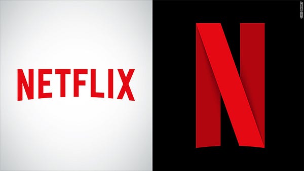
The new icon drops the ‘etflix’ with just the ’N’ remaining. The flat letterform has been redesigned as an angular ribbon with subtle drop shadows, giving the illusion of depth.
Netflix has described the icon as a “new piece of statement jewelry” on Twitter when some people questioned if the icon would indicate a full brand redesign. But the new icon — as of now — will only be used for the company’s social media profiles and mobile app.
For Netflix and for the user experience with their brand, the logo decision makes complete sense. Using only the ’N’ will be more recognizable and readable on small screens. And when you’re working with images that have display sizes equivalent to that of an eraser on a #2 pencil, maximizing screen space is the top priority.
This departure from the rest of the brand has some purists up in arms, asking why Netflix didn’t just use the ’N’ straight from their sans serif logo, forgoing the addition of a ribbon altogether. The result would have been just as effective.
However, using a unique icon that differs from the main logo is nothing new. In February, Uber electrified its users with a whole new brand design, including apps that departed drastically from the company’s logo. The white geometric — almost hieroglyphic icons are paired with crossing linear patterns unique to regions. Elegant, but almost too sophisticated. Like a Rothko painting, to truly understand Uber’s app icons, you need to read the rationale that lead to the aesthetic decisions. Which you can find on Uber’s brand standards.
If Uber’s new icons were like a shock wave, Netflix’s are barely a ripple. The new ’N’ is hardly revolutionary. Ribbon motifs are a pretty tired design trend, think 2011 Microsoft Suite. Although the Netflix icon is flatter and sharper, it seems a bit conventional. Perhaps the ribbon is meant to harken thoughts of the Hollywood red carpet or the red curtains in a film theater? Either way, it would be interesting to see what some of the runners up were.
Regardless, it makes me wonder, what other old design trends will resurface with the continued need to optimize for smaller screens and the strive to stand out from the crowd? Maybe, companies will return to the high-gloss, extruded plastic icons of web 2.0 next?